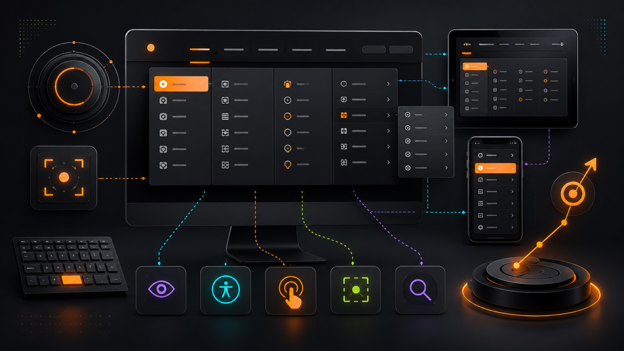
A dropdown menu should help people find information quickly without making navigation feel complicated. Good UX starts with a clear information architecture, descriptive labels, predictable interaction, and equal consideration for mouse, keyboard, touch, and assistive technology users.
Keep the hierarchy easy to understand
Group related destinations under labels customers recognize. Avoid using internal company language or creating so many levels that people lose their place. Important services and conversion paths should remain visible rather than being buried inside an oversized menu.
Design predictable open and close behavior
Dropdowns should respond intentionally to hover, click, focus, and touch. Allow enough time for pointer movement, provide a clear way to close the menu, and avoid interactions that disappear when a cursor crosses a small gap. On mobile, use controls that expand sections without accidental navigation.
Support keyboard and screen reader access
Every trigger and link must be reachable with a keyboard, display a visible focus state, and follow a logical order. Use semantic navigation markup and accurate expanded-state attributes. Test with real keyboard interaction and assistive technology instead of assuming visual appearance is sufficient.
Use readable spacing and touch targets
Menu items need adequate contrast, type size, line height, and separation. Touch targets should be large enough for mobile users and should not sit too close together. Responsive layouts may need a different structure rather than shrinking a desktop mega menu.
Measure navigation performance
Review search behavior, menu interactions, exits, conversions, and support questions to identify confusing labels or missing paths. Usability testing with representative customers can reveal problems that analytics alone cannot explain.
UX web design in NYC
WD23 designs accessible navigation systems for corporate websites, ecommerce stores, medical practices, luxury brands, real estate, and custom applications in Manhattan and across the United States. We connect UX strategy with web development, SEO, analytics, and conversion optimization.