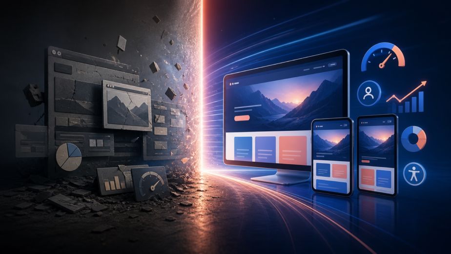
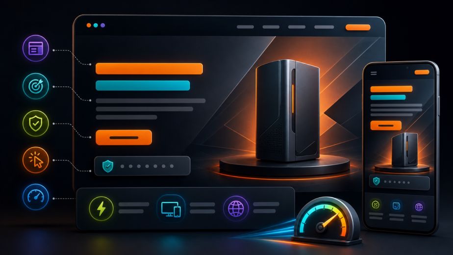
Ghost buttons are transparent or lightly filled calls to action defined by a visible outline. Their restrained appearance can support premium web design, large visual backgrounds, and minimal interfaces, but style alone does not make them effective. A ghost button must remain easy to recognize, understand, and use across every screen.
Why ghost buttons became popular
Outlined controls create less visual weight than solid buttons, allowing photography, product imagery, typography, and interface structure to remain prominent. They can provide an elegant secondary action and help a modern website feel open and sophisticated. The challenge is maintaining sufficient contrast and a clear hierarchy.
Use hierarchy to protect conversions
The primary action should normally be the easiest control to identify. A solid button often works best for purchasing, booking, requesting a consultation, or starting checkout. Ghost buttons can support secondary actions such as learning more, viewing specifications, or exploring related content. When every control uses the same outline treatment, customers may struggle to identify the next step.

Contrast and background selection matter
Transparent buttons inherit the complexity behind them. A fine outline may disappear over a bright photograph, moving video, gradient, or detailed product image. Test every breakpoint and content variation. A subtle overlay, stronger border, controlled fill, or dedicated background area can preserve readability without losing the desired visual character.
Design clear hover and focus states
Desktop hover effects should confirm that the control is interactive, while keyboard focus must remain visible and distinct. Touch devices do not provide a dependable hover state, so the default appearance must communicate clickability. Motion should be restrained and should respect reduced-motion preferences.
Make outlined controls accessible
Use descriptive button text, sufficient color contrast, generous touch targets, semantic links or buttons, and a logical keyboard order. Do not rely on color alone to communicate status. Test with keyboard navigation, screen readers, zoom, high-contrast settings, and common mobile devices.
Test ghost buttons with real customer journeys
Analytics and usability testing can reveal whether outlined controls receive attention and support conversions. Compare click-through rates, form completion, checkout progression, and mobile behavior. A design trend should remain only when it helps customers understand the interface and complete meaningful actions.
Conversion-focused web design in NYC
WD23 designs corporate websites, ecommerce experiences, landing pages, and custom applications for Manhattan and United States brands. We connect visual design with accessibility, responsive development, SEO, analytics, AI, cloud hosting, and conversion strategy so every interface decision supports a polished customer experience and measurable growth.